READ TIME - 2 MINUTES
Are you tired of the cumbersome syntax of CSS media queries? Learn how the new syntax can streamline your workflow. You make your code cleaner and more readable by using the new syntax.
Using the new CSS media query syntax will save you time and effort. It allows you to write more efficient and maintainable code.
Many developers struggle with the verbosity of traditional media queries. Misunderstandings and errors are common, but the new syntax offers a simpler solution.
Say Goodbye to Min-Width & Max-Width
The new CSS media query syntax revolutionizes how we define responsive breakpoints. It makes our code cleaner and easier to understand.
The Benefits of the New Syntax
- Clarity: The new syntax is simple and intuitive.
- Efficiency: Reduced complexity leads to faster development.
- Compatibility: High support across modern browsers. You can check it out here.
Code Examples
Traditionally, you might write:
With the new, simpler syntax, it becomes:
- The new syntax uses a more intuitive comparison format.
- It eliminates the need for min-width and max-width.
- Broad support across modern browsers.
You can also apply it for a maximum width...
Old way:
New way:
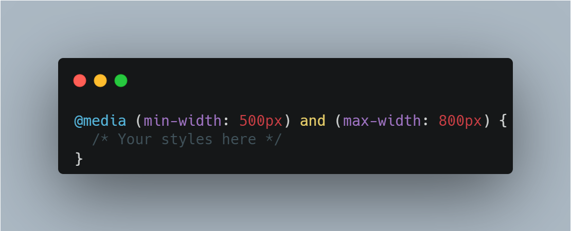
You can also test between two widths...
Old way:
New way:
Conclusion
Adopting the new CSS media query syntax will simplify your code. You can focus on creating responsive designs with ease.
Experience a more streamlined way to handle media queries in your projects. Embrace this new syntax!
Please, comment on your thoughts. Your thoughts are valuable to contribute to the front-end development field. All are welcome! I want to hear them.
Keep up the good work! :)


Awesome loved it will use it in my next project
Thanks, checking this out