READ TIME - 3 MINUTES
Flexbox is a powerful CSS layout model that makes it easy to create flexible and responsive web layouts. In this article, you'll learn how to build layouts with Flexbox from scratch, making your designs adaptive to any screen size.
Flexbox allows you to create layouts that adapt seamlessly across devices. If you've struggled with floats or positioning before, this will change how you approach layout design, helping you work more efficiently.
Many beginners don’t take the time to fully understand the flex container and flex items, leading to frustration when elements don’t align as expected. Learning these foundational concepts will save you from common pitfalls.
Master Flexbox and Simplify Your Layouts
Flexbox revolutionizes layout design by offering a flexible system that works beautifully for row and column-based layouts. Whether you're building navigation bars, galleries, or complex grids, Flexbox is your go-to tool.
Key Takeaways
Flexbox uses two main components: flex containers and flex items. Containers define the parent element, while flex items are the children within the container.
Direction control: Flexbox allows you to align items in rows or columns with the
flex-directionproperty.Alignment and space distribution: You can control the alignment of items with
justify-content,align-items, andalign-self.Responsiveness: Flexbox automatically adjusts elements based on screen size without complex media queries.
Setting Up Flexbox
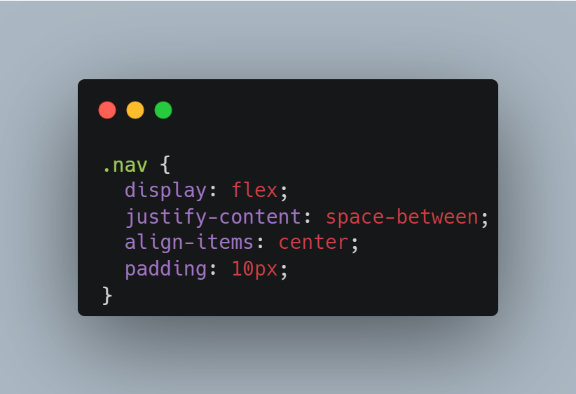
To start using Flexbox, define a container with the display: flex; property. This enables the Flexbox model and allows you to control the layout of its child elements.
Aligning Items
Flexbox gives you powerful tools to align items within the container. Use justify-content to control the horizontal alignment and align-items for vertical alignment.
justify-content: space-between;evenly spaces items across the container, ensuring the logo stays on the left and the menu items on the right.align-items: center;vertically centers the content within the flex container.
Flexbox Example: Building a Simple Navigation Bar
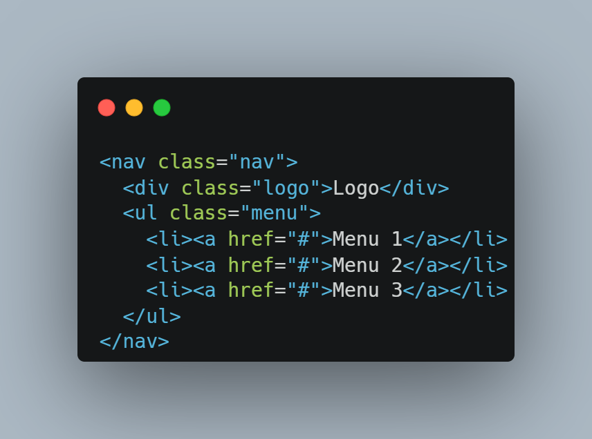
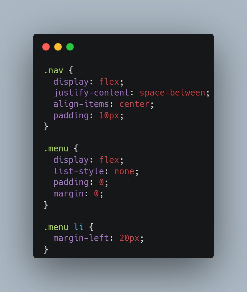
Let’s apply these Flexbox features to a navigation bar layout. Here’s the HTML and the CSS:
In this example:
The navigation bar uses Flexbox to arrange the logo on the left and the menu on the right.
The menu is displayed as a row of items, thanks to Flexbox, with each menu item spaced evenly.
If you want to master your Flexbox skills…
You can check out this web: https://flexboxfroggy.com/
It’s a friendly game to practice with Flexbox. Strongly recommended!
Conclusion
Mastering Flexbox can be a game-changer for your front-end development skills. Its ability to:
Simplify layouts
Improve responsiveness
Minimize complex CSS rules
makes it an essential tool in modern web design. Start using it today, and you'll see the difference it makes in your workflow.
By understanding how Flexbox works, you'll save time and avoid frustration, giving you the confidence to build responsive layouts with ease.
See you next Saturday!
Keep up the great work! :)


